Save Up
Money saving tool — UX/UI design case study
introduction
This case study explores the struggles people face when saving for big life events or major purchases. I set out to solve this because saving shouldn’t feel stressful or confusing. With simpler, more intuitive tools, reaching financial goals can feel empowering and actually achievable.
My role
UI/UX Design
User Research & Interviews
User Flows
Usability Testing
Wireframing & Prototyping
Style Guides & Iconography
Responsive Design
Tools
Figma

problem
Many people struggle to save money and without clear guidance and accessible tools, they risk falling short of their financial goals.
solution
Goal: create a user flow that feels natural and motivating
Approach: combine real user insights with thoughtful design
Outcome: an app that simplifies money management
Bonus: keeps users engaged and on track toward their savings goals
Process
01
user research
Through user interviews, I identified the needs and pain points users faced with existing money-saving apps. I analysed the research and extracted the key insights to guide the design process.
Next steps
01
User Flow Diagram
The user flow outlines the complete process of logging in or signing up to setting a savings goal and accessing the user dashboard.
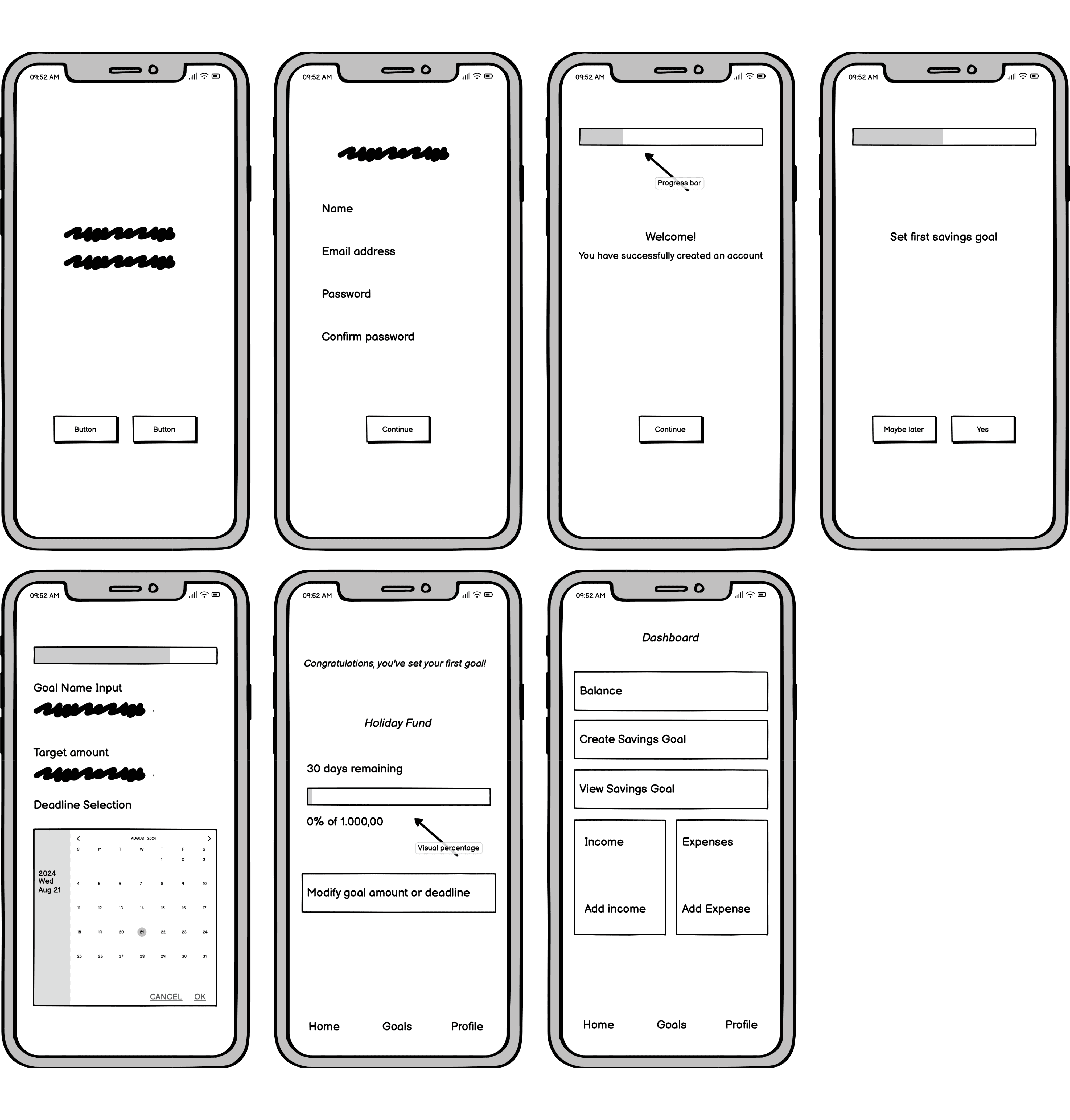
Wireframes
01
Mid fidelity
Mid-fidelity wireframes were created to develop the user flow and a Balsamiq prototype for user testing.
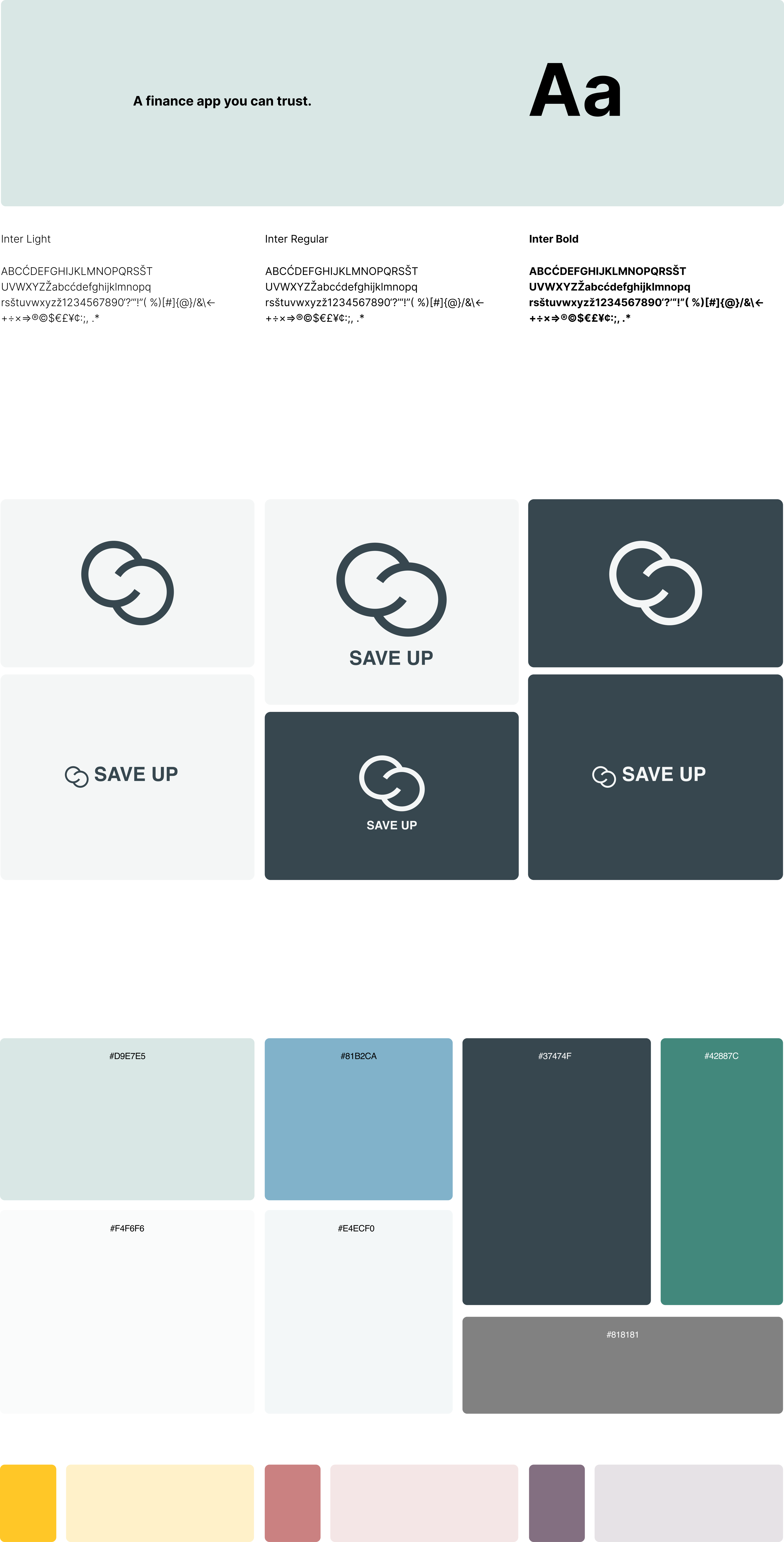
Style guide
01
typography
Tone: professional yet friendly, trustworthy and approachable
Voice: empowering and motivational
Purpose: to inspire users to take control and achieve their financial goals
02
logo
The logo applies core design principles to build trust. Clean lines and balanced proportions convey professionalism, while calming blues evoke reliability, strengthening the brand’s credibility.
03
colours
Guided by colour theory, I made intentional design choices to build trust. Calming blues and neutral tones convey reliability and professionalism, helping the brand feel more trustworthy to its audience.
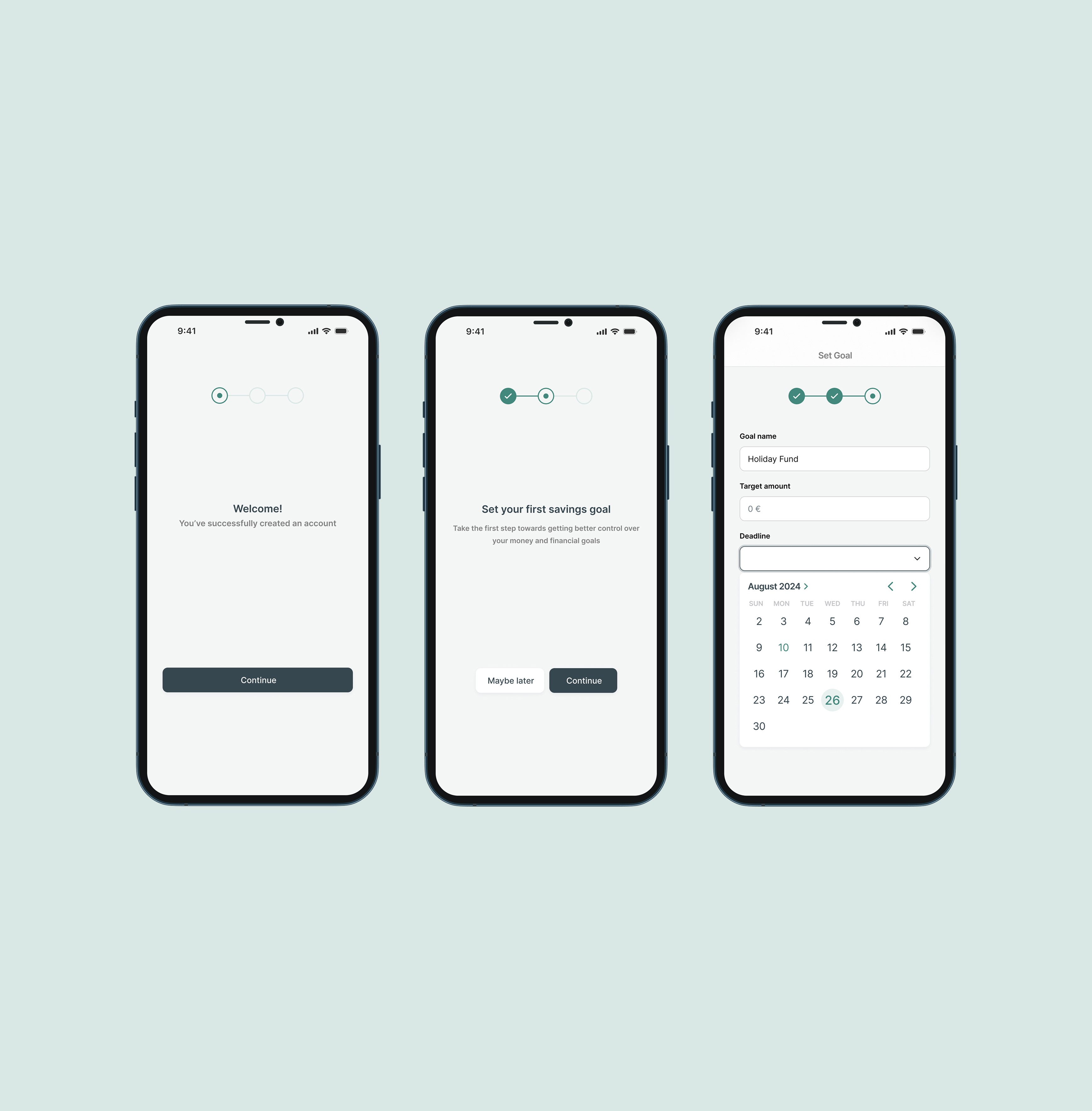
What I learnt
01
User Pain Point
During tests users felt unsure about how long the form process would take and where they were in the flow, leading to drop-offs mid-way through.
02
What I Did
I designed a progress indicator with clear step labels. I tested a few styles with users, the most effective being a simple tick-circle design - unobtrusive and easy to follow.
03
outcome
Users said they felt more in control of the process, with clearer expectations from start to finish. This led to increased completion rates.
UI
01
design
The user flow allows users to quickly and simply sign up or log in and begin their savings journey by creating a savings goal.
02
Motivational language
Short, encouraging messages have been added to the sign-up process and dashboard to uplift users, reinforcing that the app is here to support and motivate their savings journey.
03
Responsive Design
The design is built to be fully responsive, ensuring a consistent and optimal user experience across all devices and screen sizes. It adjusts the layout and content to fit different screens.